August 2023: There are currently no longer any consistent, daily, and reliable data sources for COVID cases in the United States. Johns Hopkins University, the default and most reliable data source, no longer publishes updates.
The dataset from Our World in Data dataset (change "Data Source" to "Our World in Data") is now collected almost exclusively from World Health Organization (WHO) data. The WHO data is updated by WHO member countries and updates have appeared to show to trickle (not uncommon to see months between updates from some countries).
91-DIVOC will remain active for some time as an archive of COVID-19 data, but will no longer see any updates. I'm looking forward to the next project and I hope you'll join me in nerding out with data there! :)
If you either write me (waf@illinois.edu) or join the e-mail list, I will let you know when it's available.
It was an honor to have you visit 91-DIVOC and trust me for a source to nerd out with data. I hope we cross paths again! :)
- wade
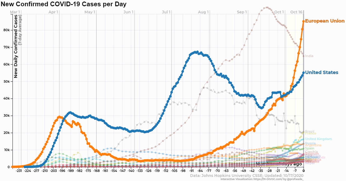
All of the data presented on this visualization comes from a trusted, high-quality data source: either Johns Hopkins University, Oxford University (Our World in Data), or The Atlantic (COVID Tracking Project). You can switch between the data sources by using the "Data Source" control at the top of the visualization. By default, Johns Hopkins University is displayed by default but your data selection can be stored by bookmarking a "Direct Link" that is displayed below each of the visualizations. All data sets are updated multiple times each day.
In the visualization controls, the "Data" selection allows you view various different data about COVID-19, including cases, deaths, tests, hospitalizations, test positivity rates, case fatality rates, and more. If a data selection is not available for a selected source, you will be prompted to switch to a data source where the data is available.
The specific data source used will always be displayed in the lower-right corner of the graph.
In addition to the country and state data provided by the data sources, several regions are added for additional context. These regions include:
The first two visualizations displays the raw case data (ex: number of cases, deaths, tests, etc). The last two visualizations displays the same data normalized by the official population displayed in cases per 100,000 people. This normalized view provides a more equatable comparison between regions of different sizes (ex: California, Texas, Illinois, and New York will have more cases if the distribution of cases were uniform simply because they have more residents). The formula used is:
Finally, every change you make to the visualization will generate a "Direct Link" that will link to the specific visualization you have created. You can bookmark this link to view it later or share it with friends/family to share the exact graph you are exploring.
There are many more options to explore in the visualization controls, including the ability to save an image or video/GIF of your graph. This 91-DIVOC project is a side-project of mine while I'm not working on teaching the next generation of students about Computer Science at The University of Illinois. You can read about my motivation for creating this project, and some of the uses it has received, on the "Overview and Motivations " page.
Finally, if you have any questions or feedback, you can write to me (faculty website, and additional contact information at the bottom of this page) -- I read all of the e-mails, reply to as many as I'm able to, and I'd love to hear from you! :)