91-DIVOC-04: Coronavirus Contribution by State
June 26, 2020 > 91-DIVOC-04: "Coronavirus Contribution by State"

If you have family/friends spread out in multiple states like me, you’re probably seeing first-hand that the pandemic is not having the same impact in every state. Some states – like Texas, Arizona, California, Florida and others – are growing in new cases exponentially; other states are still on a downward trend.
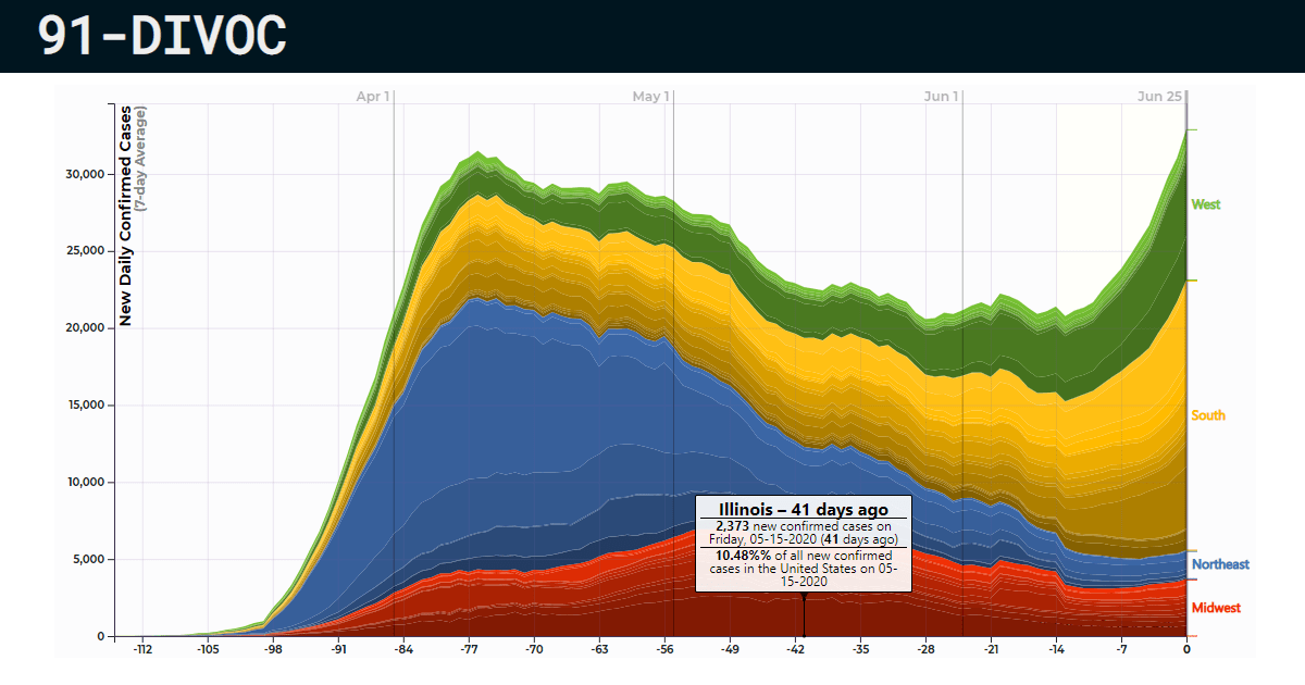
I nerded out this week and made a visualization to start to really look into where the cases in the United States are clustered and if there’s any similarities between them. I was really surprised by a few things:
-
Since the beginning of the pandemic up to one month ago, 50% of all new daily cases were located in the Northeast and Midwest. Today, under 20% of new cases are located in those regions.
-
In the month of April, over 50% of all new cases /day were located in the Northeast alone. In the month of June, nearly 50% of all new cases /day are now located in the South.
-
The political partisan affiliation of the state or governor really doesn’t show a clear trend – it’s been bad for everyone in the United States so far. I hope this might provide a little more context around COVID-19 and maybe letting you step back and see the bigger picture a little bit. You can explore all of this – along with over 1,000,000 other combinations of views/regions/data. If you have any ideas for new/interesting groupings, definitely let me know!
Check out the visualization to nerd out with me. :)