Data Source: Illinois Department of Public Health
All of the data presented on this visualization comes from the Illinois Department of Public Health’s COVID-19 website. Specifically, the data is gathered from two pages:
- “Restore Illinois” provides region-level data for test positivity, ICU utilization, ventilator utilization, and medical bed utilization.
- “COVID-19 Statistics” provides county-level data for the number of confirmed cases, deaths, and COVID-19 tests.
Regions
The “Restore Illinois” regions are based off of the Emergency Medical Services Regions, as defined in Title 77, Chapter 1(f) §515.200: Emergency Medical Services Regions. The “Restore Illinois” regions are further defined as:
- “Northeast Region” (EMS 7-11), including greater Chicago area
- “North Central Region” (EMS 1, 2), including Rockford, Quad Cities, Peoria, and Bloomington-Normal
- “Central Region” (EMS 3, 6), including Champaign-Urbana, Springfield, and Decatur
- “Southern Region” (EMS 4, 5), including greater St. Louis, Carbondale, and Mt. Vernon
The 91-DIVOC visualizations computes region totals based off of the “Restore Illinois” areas when provided county-level data.
91-DIVOC Visualization
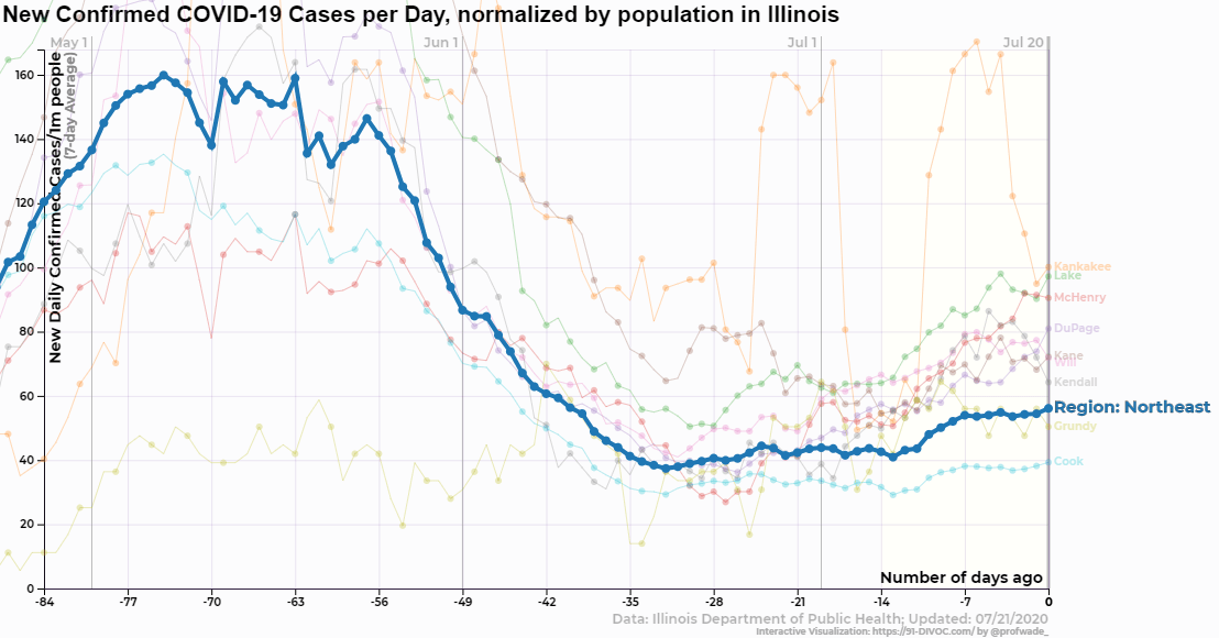
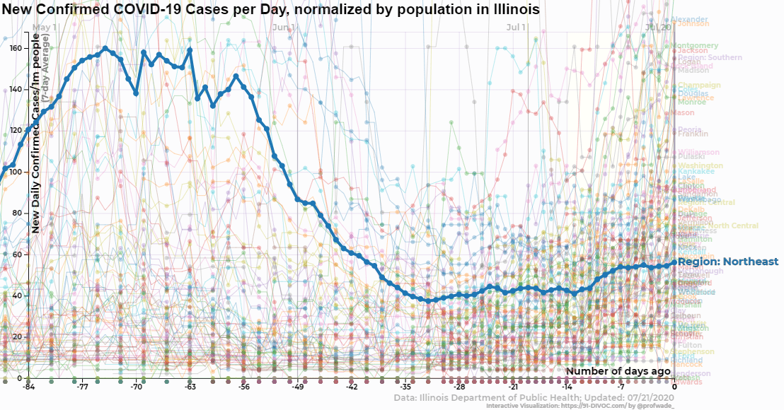
The 91-DIVOC visualization has two major ares: the visualization and the visualization controls found below the visualization. When you first arrive at the visualization, you will see a visualization of the 7-day average of the total number of confirmed cases per day.
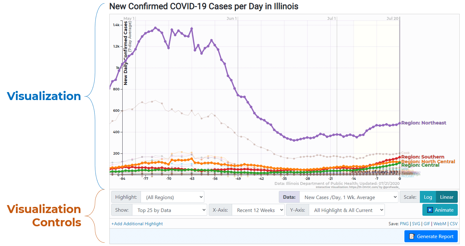
Data Options
In the visualization controls, the “Data” selection allows you view various different data about COVID-19 in Illinois. Currently, the following data choices are available:
- Confirmed COVID-19 Cases, reporting the total number of people in Illinois who has received a positive COVID-19 test.
- Confirmed COVID-19 Deaths, reporting the total number of deaths confirmed to be caused by COVID-19.
- COVID-19 Tests, reporting the total number of COVID-19 tests administered.
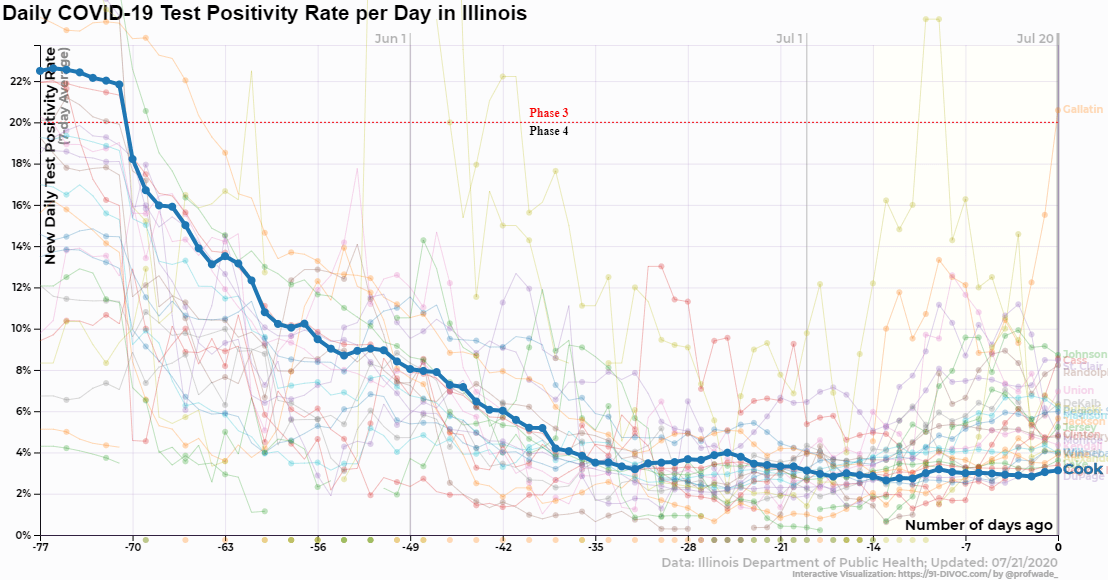
- Test Positivity, the percentage of tests administered that returned a positive result.
- This value can be computed approximately by taking the number of confirmed cases divided by the total number of tests.
- The Illinois Department of Health also provides this value at a region-level.
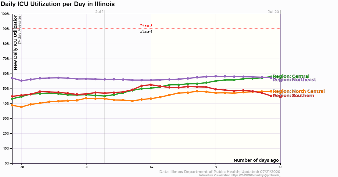
- ICU Utilization, reporting the capacity of Intensive Care Units (ICUs).
- Ventilators in Use, reporting the use of available ventilators.
- Medical Beds in Use, reporting the use of medical/surgical beds in hospitals.
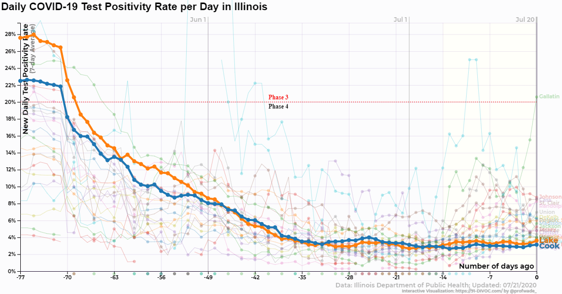
Restore Illinois Phase 3/Phase 4 Threshold
On the “Restore Illinois” page, the Department of Health shows gauge visualization of six factors including test positivity, ICU utilization, ventilator use, and medical/surgical beds. When viewing those charts, displays this gauge as a dashed red line showing when the gauge would reach the “Phase 3” threshold.
Highlight Options
In the visualization controls, the “Highlight” selection allows you view various data on different regions and counties across Illinois.
- At the top of the list, “(None)” and “(All Regions)” allow you to highlight nothing or all four regions.
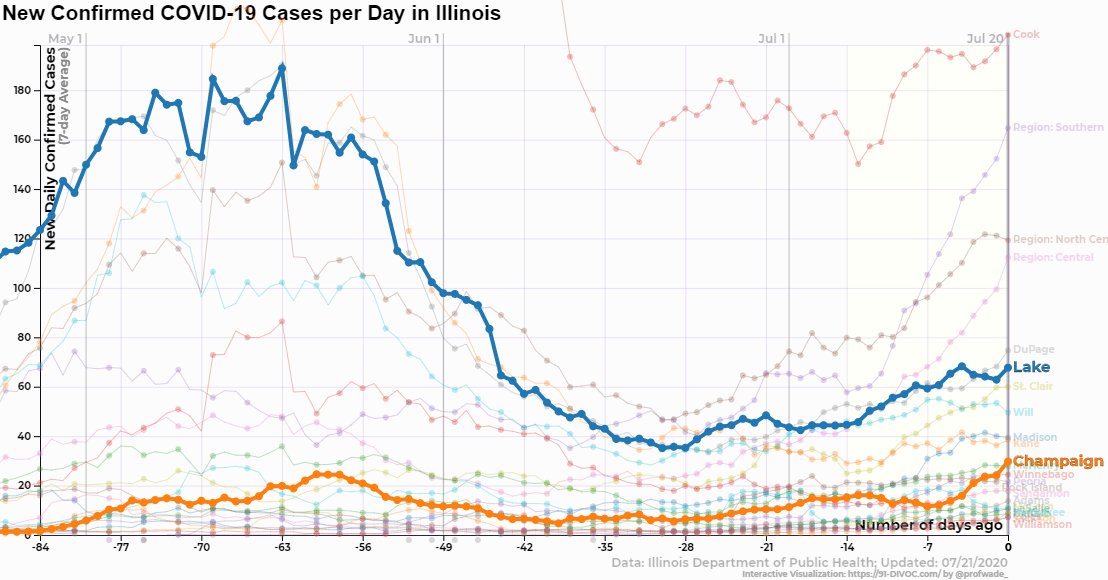
- Below that, every Illinois county with COVID-19 is available. You can select to view counties like Cook County, Lake County, Champaign County, and over 100 others.
Additional Highlights
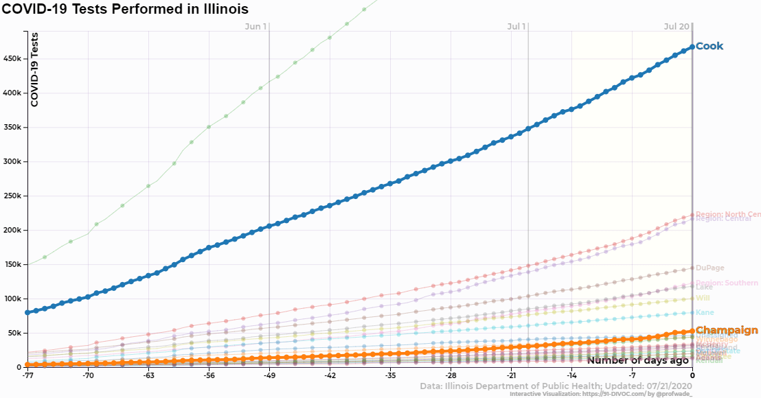
It is often useful to highlight multiple counties to compare case data between various counties. Towards the bottom of the visualization controls, the “+Add Additional Highlight” allows you to highlight multiple regions/counties at once. For example, we can compare the number of tests administered in Lake County vs. Cook County or the test positivity of Cook and Lake Counties:
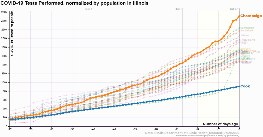
Normalized by Population
All data presented can be viewed either as raw numbers (the first visualization displayed) or normalized by the county population (the second visualization displayed). In both visualizations, the same data is displayed except that the normalized data is divided by the county population. The normalized data is then presented as per 1,000,000 people.
As an example, consider the testing data of both Cook County (Illinois’ largest county, containing Chicago) and Champaign County (a mid-sized county, containing the University of Illinois at Urbana-Champaign).
-
As of July 20, Cook County has administered 467,104 COVID-19 tests. With a county population of 5,150,233 people, Cook County has 0.090696 tests /person – or 90,696 tests /1,000,000 people.
-
As of July 20, Champaign County has administered 52,555 COVID-19 tests. With a county population of 209,689 people, Champaign County has 0.250633 tests /person – or 250,633 tests /1,000,000 people.
This normalized view of the data allows each county to be compared in a way that focuses on how each individual person in the county is doing and provides a good county-to-county comparison.
Show Options
Behind the highlighted data, other data is shown slightly faded to provide greater prospective on the highlighted data. By default, the highlighted data is displayed along with the “Top 25” counties in Illinois. There are several different options to choose by controlling the “Show” options in the visualization controls:
- Highlight Only, showing no faded data at all and only displaying the data you selected to highlight.
- Specific Regions Only, showing only counties to a specific region (ex: “Northeast”, “North Central”, etc).
- By Data, showing the specific number of counties based on their current data values (ex: “Top 25”, “Bottom 10”, etc).
- Regions/Cities Only, showing only the region lines themselves without any county-level information. Data for “Chicago” is shown when available.
- Everything, showing everything without filtering any data. Given the huge amount of data, this can sometimes create a quite messy visualization.
Many More Options
This guide only begins to explore the different options available. Additional options include:
- Using X-Axis options to control the amount of days/weeks of data is displayed.
- Using Y-Axis options to adjust the scale of the y-axis to zoom in/out of the data.
- Using Scale to switch between a linear and logarithmic view of the data.
- Using Animate to animate the graph.
- Using Save to save the current image (as a PNG or SVG), the current animation (as a GIF or WebM), or the current data (as a CSV).
- Using Generate Report to generate a report showing the largest increases/decreases of the data currently being shown.
Direct Link
Finally, every change you make to the visualization will generate a “Direct Link” that will link to the specific visualization you have created. You can bookmark this link to view it later or share it with friends/family to help them understand COVID-19 data.