NEW Visualization: Coronavirus Contribution by Country
November 11, 2020 >
During the past three month, I’ve watched along with you as the “hot spots” for the coronavirus has transitioned around the world – from the United States, to India, and recently to Europe. Building off of the design I did for the “Coronavirus Contribution by State” visualization, the newest 91-DIVOC visualization visualizes this entire world as a stacked graph with customizable options.
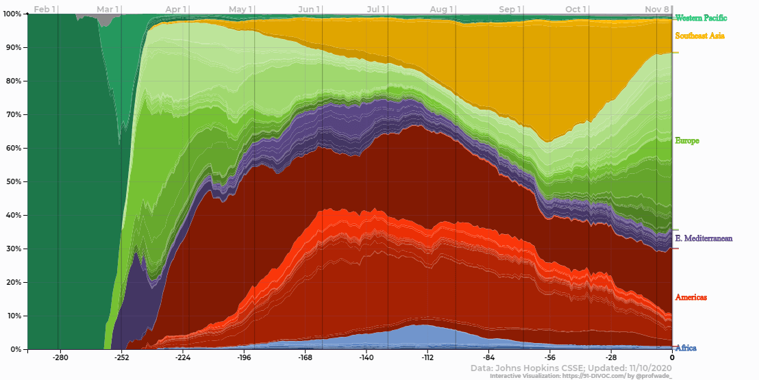
The “Stacked Percentage” View (pictured) I found really interesting – you can clearly see a surge in cases in the Americas during May, June, and July; by August, the surge was focused in Southeast Asia; and in October the current Europe surge began.
Currently, I have only two colors – WHO Regions and Population – but would be interested in adding others if there’s useful metrics to create country-groups that can classify all or nearly all countries in the world. Let me know if you know of any! :)