Interactive Visualization of COVID-19 in Illinois
July 21, 2020 > 91-DIVOC-05: "Interactive Visualization of COVID-19 in Illinois"
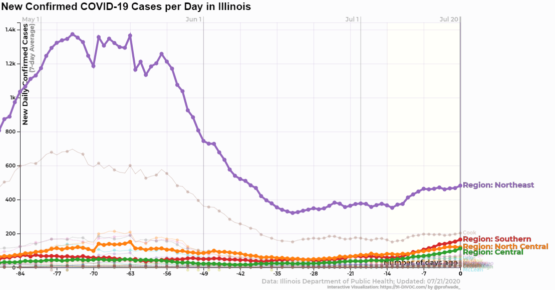
Here in Illinois, we are beginning to see an uptick of cases after fairing better than United States as a whole and slightly better than the Midwest region. As The University of Illinois looks to resume some in-person courses in the Fall, I wanted to get a glimpse of how the state has been doing over time.
Unfortunately, the visualizations on Illinois’ Department of Public Health website only gives a view of the current moment and little prospective on the trend of cases or an easy way to compare different regions. Just like the motivation for the first 91-DIVOC visualization, I wanted to nerd out with the data more.
Fortunately, Illinois has made is relatively easy to access the underlying case data. 🎉 I gathered data from the Illinois Department of Public Health’s website and graphed all of the available data I could find using the 91-DIVOC visualization tools to create my 5th standalone visualization – an Illinois-specific interactive visualization of COVID-19 data.
In this new visualization, you can view data for every Illinois county and all four “Restore Illinois” regions for the following data:
- Confirmed COVID-19 cases (cumulative, new daily, and 7-day averaged daily),
- COVID-19 deaths (cumulative, new daily, and 7-day averaged daily),
- COVID-19 tests (cumulative, new daily, and 7-day averaged daily),
- COVID-19 Test Positivity (cumulative, and 7-day average)
Additionally, detailed hospital data is available for the four “Restore Illinois” regions (but not individual counties):
- ICU Utilization (daily and 7-day average),
- Ventilators In Use (daily and 7-day average),
- Medical Beds In Use (daily and 7-day average)
All of the above data can be viewed as raw data (first graph) or normalized by county population (second graph).
If you’re not sure where to get started, I also wrote up a detailed guide of many of the features of this new visualization. If you love this type of data-forward visualizations, I have an e-mail list that I share my latest work once per month if you’d like a monthly update from me.
See you with the data! :)